A generic two-bedroom apartment gains warmth and a point of view through a highly focused budget renovation.
Our clients, a couple with a one-year-old boy, were immediately drawn to this two-bedroom on the Upper East Side, despite the fact that it was solely in need of an update. With one parent working as a neurologist at Cornell Weill, its location made it ideal for the young family — but this home was begging for help in reaching its full potential. With a strict budget in place, we focused on smart, efficient transformations in key areas that would have maximum impact on the apartment overall.
We quickly set to work undoing its damaged floors, dated appliances and fixtures, and dark floor to ceiling tiles, following a less is more approach to bring a sense of light and simplicity back to the space.
ABOVE: First up: the apartment’s single bathroom, with its claustrophobic stall shower, outdated vanity and mock marble walls. We started by stripping everything down to the essentials to create a greater sense of light. Opening up the wall between the shower and the sink, and fitting in glass panels, allows the space to flow with newfound sophistication. Light wood cabinetry and tile work parquet strike an interesting visual contrast and add warmth and texture to pure white walls. Streamlined accessories and fixtures from Kohler and local Brooklyn suppliers serve every need with elegance, ensuring that every design element has a specific function.
ABOVE:
The kitchen, another high traffic zone, began as a generic New York City galley space with conventional appliances and cabinetry and unimaginative tile work on the floors and up the walls. To create a more welcoming vibe, and enhance its utility, we ripped out the entire kitchen and started from scratch, introducing minimalist gloss white cabinetry (which subtly reflects and maximizes sunlight) and sleek stainless appliances for a modern feel. We replaced the linoleum flooring with clean, rectangular slate tiles, echoing the pattern in the white subway tiles that double as a backsplash. A simple globe light overhead adds an unexpectedly refined note to this functional space.
By overhauling these two key zones, the apartment now has a much more contemporary energy, blending elevated accents and cleverly chosen materials for a cozily efficient small-family home.
Before & After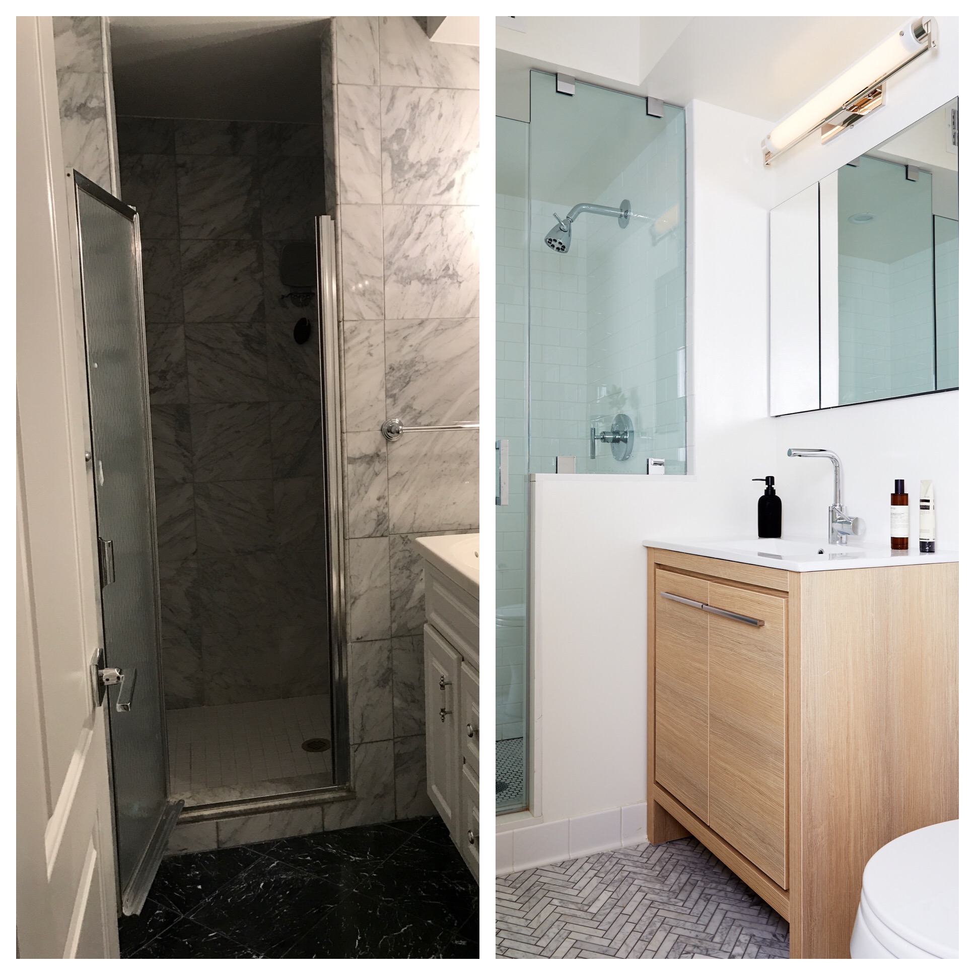
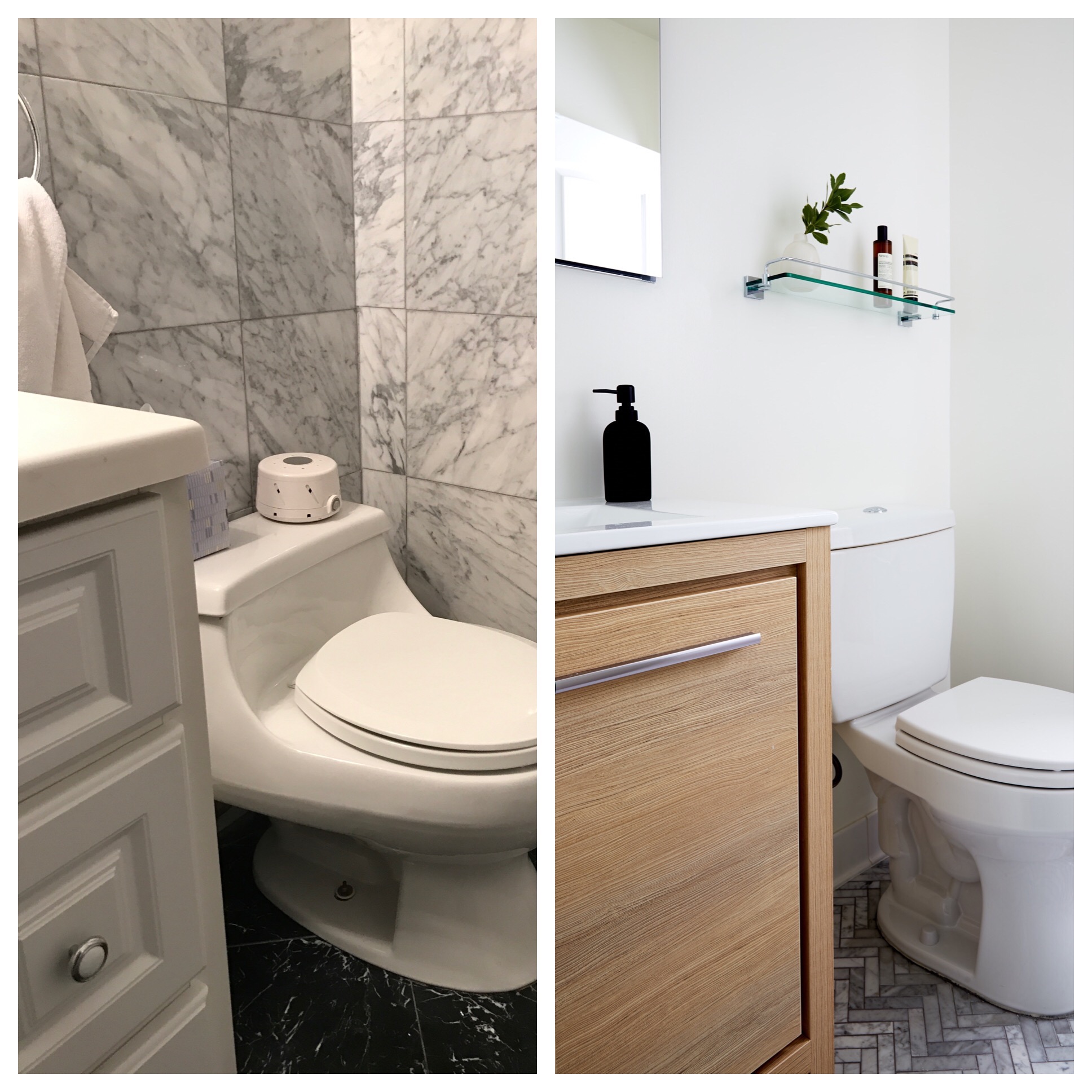
BEFORE: The shower bathroom had a claustrophobic stall shower, outdated vanity and mock marble walls.
AFTER: Opening up the wall between the shower and the sink, and fitting in glass panels, allows the space to flow with newfound sophistication. Light wood cabinetry and tile work parquet strike an interesting visual contrast and add warmth and texture to pure white walls.
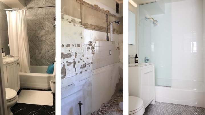
BEFORE: The apartment’s second bathroom had a tub and bulky furniture.
AFTER: The nearly all-white bathroom means that the textures are especially important: the subtle grey’s in the marble floor tiles compliment the shiny subway tiles in the shower. The key element is the new sliding glass shower door which now gives the space a pleasingly minimal visual footprint.
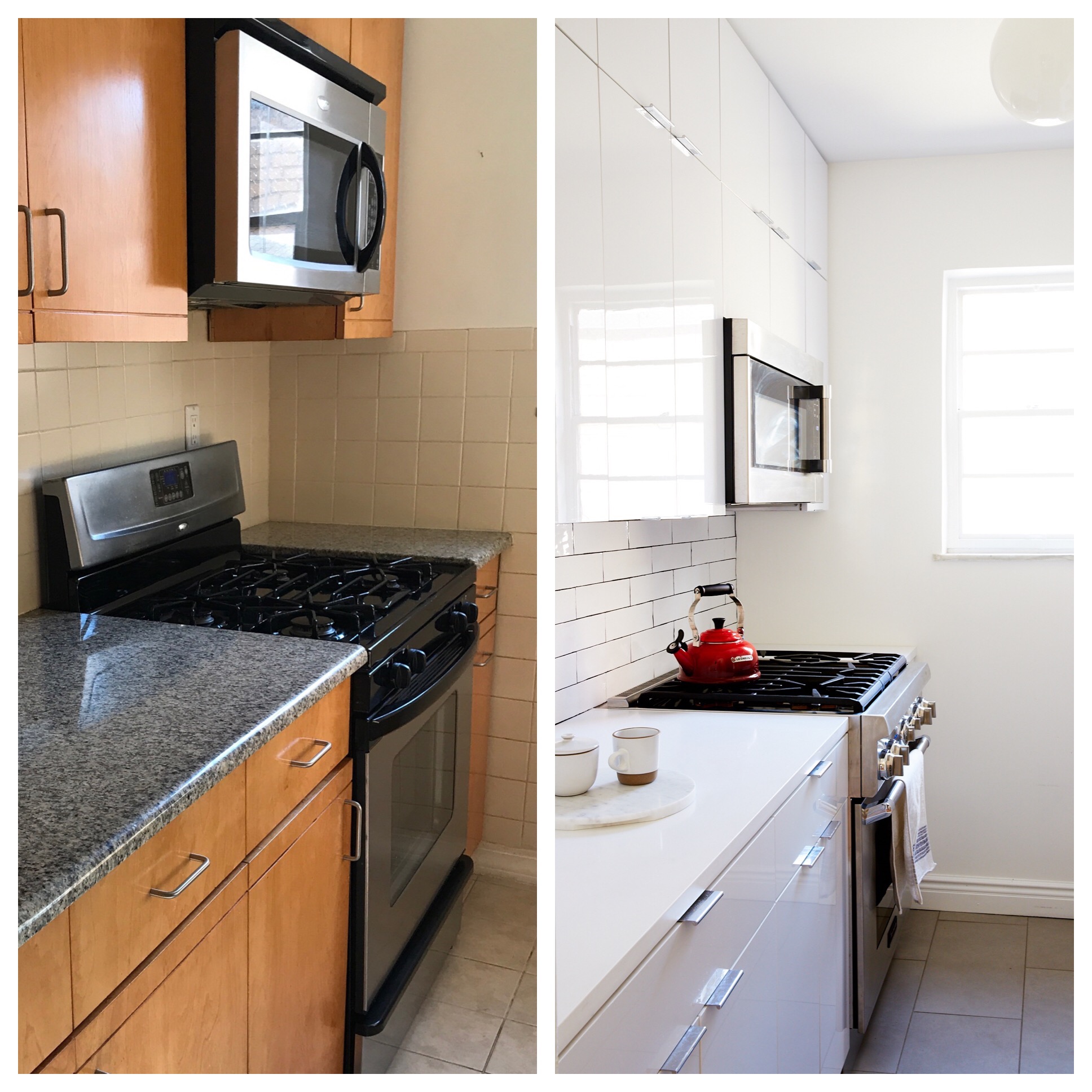
BEFORE: Dark wood cabinetry and countertops were not helping the galley kitchen, which felt narrow enough as it is.
AFTER: Sticking to simple white cabinetry, minimal hardware, and hidden appliances made for an airy, seamless new look.
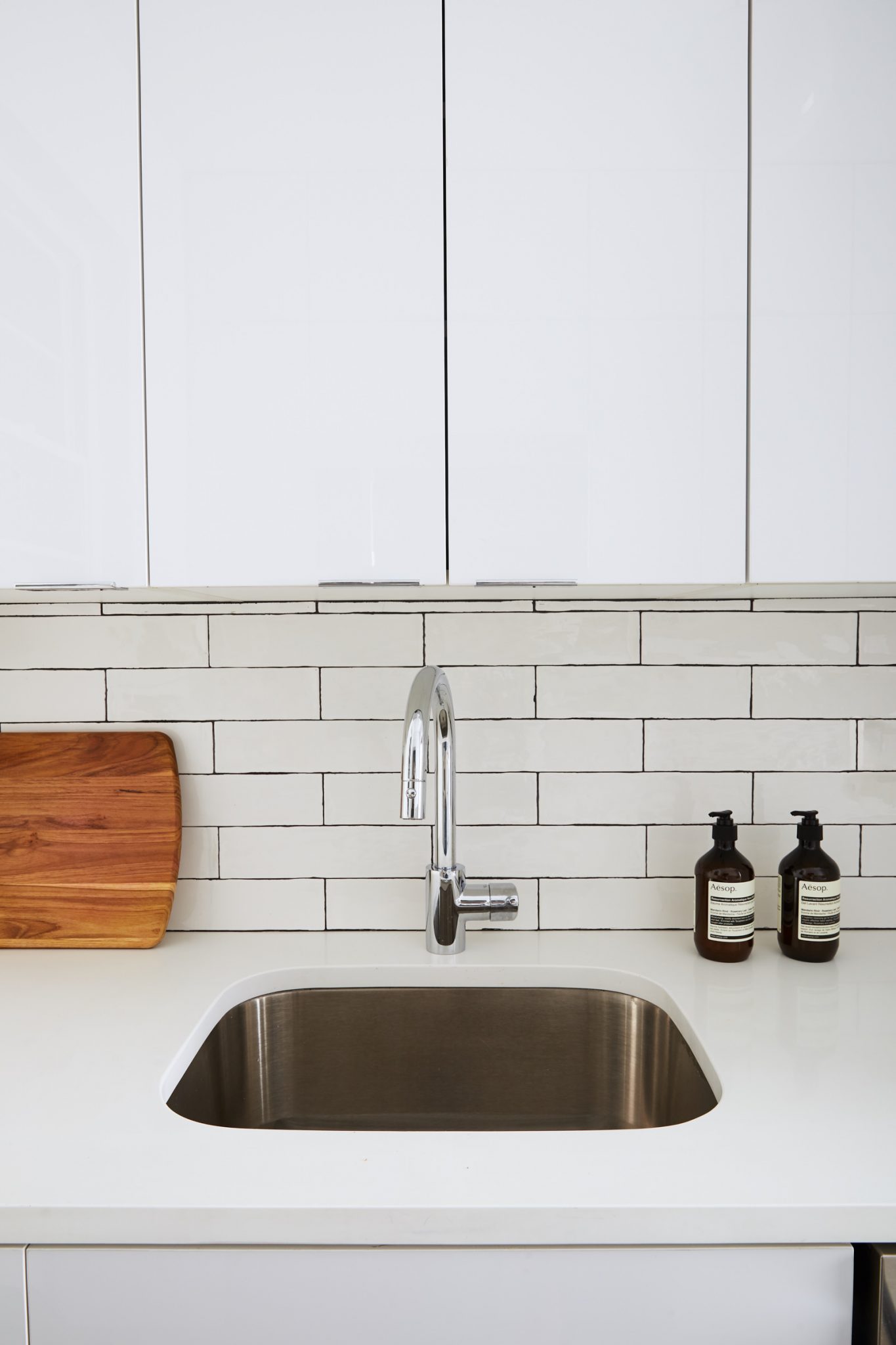
For the backsplash we went with a white ceramic subway tile, the jeans and t-shirts of the tile world! They’re basic, but paired with a dark grey grout they feel modern and can transform a small space. Tip: this look works best when you keep the rest of the space pretty neutral.


